The background is pattered paper from Cosmo Cricket. The flower is a large die cut from K & Co. It inspired the entire page design because it is so big and bold. The title sentiment is also from K & Co, popped up with foam tape. I keep running into sales on K & Co. products at Michaels and AC Moore and I can't help but stock up! The final supply I used was just a pigment pen to add the date in the lower right corner. One of the easiest, peasiest pages I've done in a long time! Really, is it missing something? Maybe in the upper left corner?
Monday, August 5, 2013
Simple (?) layout
Simplicity has never been my forte when it comes to scrapbooking. I generally follow the theory that more is more. Here's a page that uses only five supplies! I'm not sure if I should be proud of myself or concerned that something is missing. It really does feel a little... plain to me. What do you think?
The background is pattered paper from Cosmo Cricket. The flower is a large die cut from K & Co. It inspired the entire page design because it is so big and bold. The title sentiment is also from K & Co, popped up with foam tape. I keep running into sales on K & Co. products at Michaels and AC Moore and I can't help but stock up! The final supply I used was just a pigment pen to add the date in the lower right corner. One of the easiest, peasiest pages I've done in a long time! Really, is it missing something? Maybe in the upper left corner?
Wednesday, July 24, 2013
Patterned paper possibilities
I've been scrapbooking a lot lately! I know I should be packing up my craft supplies in preparation for our move instead but I just can't make myself do it until a little closer to our actual move date. Crafting makes me happy and sane, both of which I need right now!
This layout focuses my my daughter and her babysitter's daughter. I love getting photos during the day that show me how happy she is and the fun that she is having. Here I paired some patterned papers that I usually would never put together but I wanted the layout to be colorful and reflect what was going on in the photo. I thought the number paper from the My Minds Eye Lime Twist collection (I'm still really loving this stack!) was related to the fact that they are in the library (OK, letters would have made more sense...) and the cloud paper from American Crafts showed that it was a rainy day, hence my daughter's polka dot raincoat. The plaid paper (I think from the Target Dollar Spot) picked up the color of her friend's coat and the flowered strip (DCWV Kidlet stack) was fun and tied the colors together. The blue strip at the top was kind of a random addition that I'm not sure if really adding anything. I just happened to be going through my sticker stash and found the chipboard "Pals" title (DCWV) as a last minute addition. The date sticker is from the Target Dollar Spot (so many cool bargains abound there!) and the little sticker next to it that says "Sweet" was a freebie for renewing some magazine.
Maybe one of these days I can actually catch up a big and scrapbook some 2013 events! The photos in this next layout are even older, as you can see that my daughter was just a baby. How time flies!
Again I paired patterns that usually I wouldn't pick. I really am trying to use up some of my stash and stretch my creativity (sometimes with mixed results, I know!). These are some really old papers from Colorbok. I also used one of those foam craft stickers for kids as the embellishment. The journaling and date label are digital elements that I printed. I punched holes down the side and ripped some to the edge to simulate authentic notebook paper.
The photo in this last layout is from around the same time. To make it I used a lot of the scraps generated from the previous two layouts. Since I scrap 8.5 by 11, I usually cut an inch off of each sheet of 12 by 12 paper before I start using it. I've organized these 1 by 12 inch strips in a box that I can pull out when I need a quick border. I found out that they also make a cool background!
The title is from a very old DCWV kit but it just happened to fit my subject. I really am trying to use up my stash! I love that simple layered flower sticker in the lower right. Kind of hides the fact that I cut the plaid pink strip too short! A mistake is just an opportunity for creativity, right?
This layout focuses my my daughter and her babysitter's daughter. I love getting photos during the day that show me how happy she is and the fun that she is having. Here I paired some patterned papers that I usually would never put together but I wanted the layout to be colorful and reflect what was going on in the photo. I thought the number paper from the My Minds Eye Lime Twist collection (I'm still really loving this stack!) was related to the fact that they are in the library (OK, letters would have made more sense...) and the cloud paper from American Crafts showed that it was a rainy day, hence my daughter's polka dot raincoat. The plaid paper (I think from the Target Dollar Spot) picked up the color of her friend's coat and the flowered strip (DCWV Kidlet stack) was fun and tied the colors together. The blue strip at the top was kind of a random addition that I'm not sure if really adding anything. I just happened to be going through my sticker stash and found the chipboard "Pals" title (DCWV) as a last minute addition. The date sticker is from the Target Dollar Spot (so many cool bargains abound there!) and the little sticker next to it that says "Sweet" was a freebie for renewing some magazine.
Maybe one of these days I can actually catch up a big and scrapbook some 2013 events! The photos in this next layout are even older, as you can see that my daughter was just a baby. How time flies!
Again I paired patterns that usually I wouldn't pick. I really am trying to use up some of my stash and stretch my creativity (sometimes with mixed results, I know!). These are some really old papers from Colorbok. I also used one of those foam craft stickers for kids as the embellishment. The journaling and date label are digital elements that I printed. I punched holes down the side and ripped some to the edge to simulate authentic notebook paper.
The photo in this last layout is from around the same time. To make it I used a lot of the scraps generated from the previous two layouts. Since I scrap 8.5 by 11, I usually cut an inch off of each sheet of 12 by 12 paper before I start using it. I've organized these 1 by 12 inch strips in a box that I can pull out when I need a quick border. I found out that they also make a cool background!
The title is from a very old DCWV kit but it just happened to fit my subject. I really am trying to use up my stash! I love that simple layered flower sticker in the lower right. Kind of hides the fact that I cut the plaid pink strip too short! A mistake is just an opportunity for creativity, right?
Friday, July 12, 2013
Kids' birthday cards
My daughter has also been invited to a lot of birthday parties lately
and I've been trying to make a quick card for each kid. I've really been
loving making strips of patterned paper into banners. It's fast, colorful and uses up those scraps that I always feel guilty about throwing away.
TIP: I used a square punch to make the triangular portion of the banner. You can use any size square punch as long as it's bigger than your paper strip. Just feed end of the strip through the punch, held diagonally, so you cut off a symmetrical triangle shape. So much easier than using scissors or a craft knife!
Please pardon my photography -- my scanner has been on the fritz so I photographed the cards and I don't have any kind of professional setup for card photography.
A cute first birthday card using primary colors:
I stamped the elephant directly onto the card using Charcoal Colorbox chalk ink, then drew the string of the balloon. The hat I cut freehand from patterned paper and for the balloon I used a circle punch, then inked the edges. I cut out the 1 using my Cricut and used that ever-popular Fiskars scallop sentiment punch to make the ground the elephant stands on. After cutting and assembling the banner strips, I stamped the birthday boy's name.
A horizontal variation, this one totally girlie. I'm sure you can see the influence of the first card on this one! Instead of the elephant I stamped with Charcoal chalk ink (as you can see, it's one of my favorite inks!) a large sentiment that I decorated with dots of clear Stickles. Instead of stamping directly on the card, I used a white panel and attached that to an aqua card base. I was able to wrap a piece of pink ribbon around the white panel this way (I hate for the ribbon ends to be seen in the inside of the card -- pet peeve). I stamped the birthday girl's name on white card stock and punched out the letters with a small circle punch, then attached them with pop dots. I added a Prima flower and of course a gem because this was for a very girlie two-year-old. I also embellished the designs on the patterned papers with additional Stickles, because you can never have too much glitter, right?!
TIP: I used a square punch to make the triangular portion of the banner. You can use any size square punch as long as it's bigger than your paper strip. Just feed end of the strip through the punch, held diagonally, so you cut off a symmetrical triangle shape. So much easier than using scissors or a craft knife!
Please pardon my photography -- my scanner has been on the fritz so I photographed the cards and I don't have any kind of professional setup for card photography.
A cute first birthday card using primary colors:
I stamped the elephant directly onto the card using Charcoal Colorbox chalk ink, then drew the string of the balloon. The hat I cut freehand from patterned paper and for the balloon I used a circle punch, then inked the edges. I cut out the 1 using my Cricut and used that ever-popular Fiskars scallop sentiment punch to make the ground the elephant stands on. After cutting and assembling the banner strips, I stamped the birthday boy's name.
A horizontal variation, this one totally girlie. I'm sure you can see the influence of the first card on this one! Instead of the elephant I stamped with Charcoal chalk ink (as you can see, it's one of my favorite inks!) a large sentiment that I decorated with dots of clear Stickles. Instead of stamping directly on the card, I used a white panel and attached that to an aqua card base. I was able to wrap a piece of pink ribbon around the white panel this way (I hate for the ribbon ends to be seen in the inside of the card -- pet peeve). I stamped the birthday girl's name on white card stock and punched out the letters with a small circle punch, then attached them with pop dots. I added a Prima flower and of course a gem because this was for a very girlie two-year-old. I also embellished the designs on the patterned papers with additional Stickles, because you can never have too much glitter, right?!
Wednesday, July 10, 2013
Three months... three years
OK, it's like a I'm a once-a-month blogger. Can that be a new thing? Well my same excuses continue regarding work on the new house, which we still haven't moved into yet. The IKEA cabinets are finally installed though! To add to my list of distractions, my daughter's daycare provider quit on me and I'm scrambling to find care for the summer until she starts preschool in September. How she's almost three years old, I have no idea! It makes me nostalgic so I'm going to share a layout I recently completed (yes, I am VERY behind) from when she was just about three months old. The journaling details how I when we first talked about naming our daughter, I didn't want people to call her "Dolly" as a nickname but it has since stuck and totally fits her.
No special techniques used here. It's a hybrid layout. I printed the journaling out directly onto white cardstock. Created the title block digitally, printed it out and glued it on over two rectangles and a strip of patterned paper. Added a sticker and a flower gem. I am proud to report that I used a WAY old piece of patterned paper from my stash. The brown piece is from one of those Paper Pizzazz 8.5 by 11 booklets. Probably some of the first scrapbooking paper I ever bought, way back in the early 90s -- before 12 by 12 paper was even available, I think! I pared it up with some "modern day" Basic Grey (hearts) and DCWV (plaid).
Friday, June 14, 2013
Bubbe
So I'll say it again (yes, it's like Groundhogs Day -- have you ever seen the movie?) I have been creating but I haven't been blogging. We're attempting to finish our new house so we can finally move and I have huge work event and well there really is only so much time in the day. I guess I would rather make memories and capture them than detail my process.
Anyway, my husband's grandmother passed away two years ago yesterday. She really was a great woman -- smart, strong and opinionated, protective of her family and its traditions, but warm and welcoming. My husband saw this layout that I made of her and my daughter not too long before she died and kept asking to see it. So this one's for him.
The pink flowered and brown striped papers and the title stickers actually came from a kit, which I rarely buy. I believe it's Cloud 9 by Colorbok/Fiskars because that's what the stamps are. I looked at the flowered paper and thought, "That looks familiar!" and realized I had the coordinating stamps (Chocolate Chalet) so I used them to stamp the title block. I think it came out a little busy but it conveys the fun these two were having.
And here's another one also featuring my daughter and her great-grandma.
This one uses that brand of paper that Michaels sells, Reminisce I think (paisley), and a sheet from a new stack I just bought by My Minds Eye, Lime Twist. Yes I was supposed to be curtailing my craft purchases until after we move, but I just could not resist this stacks luscious colors and fun, versatile patterns! I was also happy to finally use the felt flower border that I've been hoarding in my stash for quite some time. I filled the flower centers in with tiny pearls and added larger pearls to the Prima flower centers.
Anyway, my husband's grandmother passed away two years ago yesterday. She really was a great woman -- smart, strong and opinionated, protective of her family and its traditions, but warm and welcoming. My husband saw this layout that I made of her and my daughter not too long before she died and kept asking to see it. So this one's for him.
The pink flowered and brown striped papers and the title stickers actually came from a kit, which I rarely buy. I believe it's Cloud 9 by Colorbok/Fiskars because that's what the stamps are. I looked at the flowered paper and thought, "That looks familiar!" and realized I had the coordinating stamps (Chocolate Chalet) so I used them to stamp the title block. I think it came out a little busy but it conveys the fun these two were having.
And here's another one also featuring my daughter and her great-grandma.
This one uses that brand of paper that Michaels sells, Reminisce I think (paisley), and a sheet from a new stack I just bought by My Minds Eye, Lime Twist. Yes I was supposed to be curtailing my craft purchases until after we move, but I just could not resist this stacks luscious colors and fun, versatile patterns! I was also happy to finally use the felt flower border that I've been hoarding in my stash for quite some time. I filled the flower centers in with tiny pearls and added larger pearls to the Prima flower centers.
Wednesday, May 8, 2013
"Beautiful" layout
Well the Ikea cabinet buying went better than expected although what I didn't expect was to not have time to post again until after they were already delivered! They haven't been put together by my contractor yet though so it's a ways away as to when I'll see my new kitchen completed.
Meanwhile, my parents came to town, which took away from my creating and blogging time, but I did finish more pages than I anticipated. Warning: pink, girly baby pages to come in the next few posts!
I finally was able to finish the page that I talked about awhile back, when I was making this starburst card for my co-worker as practice. The technique wasn't as time-consuming as I feared but I am glad I practiced it on a smaller scale first.
The journaling captures the first time I saw my daughter and I think this page does that moment justice. I got to use up a bunch of scraps that I really like. The title didn't work out as I originally planned but I love how glittery the letters are in person and how they curve around the photo. I love it!
Meanwhile, my parents came to town, which took away from my creating and blogging time, but I did finish more pages than I anticipated. Warning: pink, girly baby pages to come in the next few posts!
I finally was able to finish the page that I talked about awhile back, when I was making this starburst card for my co-worker as practice. The technique wasn't as time-consuming as I feared but I am glad I practiced it on a smaller scale first.
The journaling captures the first time I saw my daughter and I think this page does that moment justice. I got to use up a bunch of scraps that I really like. The title didn't work out as I originally planned but I love how glittery the letters are in person and how they curve around the photo. I love it!
Friday, April 26, 2013
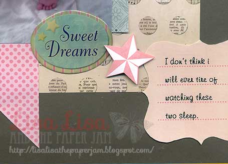
Sweet Dreams
Well I have been working very hard at work, at my actual real job, so too much creating hasn't been happening. Here's a quick page that I made that is turning out to be one of my favorites.
I love the photo itself but also the way everything is arranged.The most time-consuming part was searching for the perfect embellishments that weren't too girly for this photo of my husband fast asleep with my daughter. I just happened to see these K & Co. Edamame layered stars on my craft table and I think they are perfect with the Sweet Dreams epoxy sentiment. Detail view of cluster:
Well now it's time for sweet dreams for myself! I'm off to IKEA at the crack of dawn to order cabinets for my new kitchen.
I love the photo itself but also the way everything is arranged.The most time-consuming part was searching for the perfect embellishments that weren't too girly for this photo of my husband fast asleep with my daughter. I just happened to see these K & Co. Edamame layered stars on my craft table and I think they are perfect with the Sweet Dreams epoxy sentiment. Detail view of cluster:
Well now it's time for sweet dreams for myself! I'm off to IKEA at the crack of dawn to order cabinets for my new kitchen.
Subscribe to:
Posts (Atom)